Custom summaries and forms
Compose native, interactive components from TypeScript, PHP, or Go.
Aviato UI v1 describes interfaces as JSON. The dashboard renders native Aviato components; customer definitions cannot load scripts, iframes, HTML, CSS, or external browser assets. All SDKs produce the same document format.
Record summaries
Register one summary per collection. It replaces the Overview content below the record identity; navigation, action menu, notes and other tabs remain available. An absent, unsupported, invalid, or failed summary uses the standard overview.
import { createAviatoPlugin, ui } from "@aviato/sdk";

const plugin = createAviatoPlugin({ secret: process.env.AVIATO_PLUGIN_SECRET! });
plugin.summary("customers", ui.document(ui.node("Section", { title: "Account details" }, [
    ui.node("Property", { label: "Email", value: ui.bind("/record/email") }),
    ui.node("Property", { label: "Plan", value: ui.bind("/record/plan"), variant: "badge" }),
    {
        type: "Button",
        props: { label: "Refund" },
        onPress: { type: "action", name: "Refund last invoice" },
    },
])));
The action button opens the existing action dialog for this record. Only permitted single and bulk actions can be requested; the agent rechecks access, applies approval rules, and audits execution. Definitions cannot execute an action during rendering or supply arbitrary HTTP endpoints.
The same property layout in PHP and Go (add action buttons with a node-level
onPress event, as in the TypeScript example):
use Aviato\Laravel\Facades\Aviato;
use Aviato\Laravel\UI;

Aviato::summary('customers', UI::document(UI::node('Section', ['title' => 'Account details'], [
    UI::node('Property', ['label' => 'Email', 'value' => UI::bind('/record/email')]),
    UI::node('Property', ['label' => 'Plan', 'value' => UI::bind('/record/plan'), 'variant' => 'badge']),
])));plugin.Summary("customers", aviato.UIDocument(aviato.UIComponent("Section",
map[string]any{"title": "Account details"},
aviato.UIComponent("Property", map[string]any{
"label": "Email", "value": aviato.UIBind("/record/email"),
}),
aviato.UIComponent("Property", map[string]any{
"label": "Plan", "value": aviato.UIBind("/record/plan"), "variant": "badge",
}),
)))You can also load the same JSON file in each language and pass it to summary,
Summary, or Aviato::summary. Changing a document that uses supported components
does not require a dashboard build. Adding a new primitive requires an agent and
dashboard release that understands it.
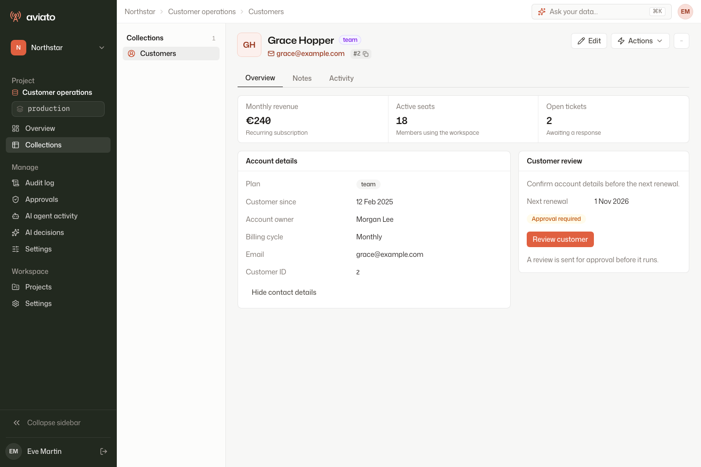
Build an overview that fits Aviato
The record header already provides the customer's name, identity, and main actions. Use the summary for information that helps operators decide what to do next:
- Group a few useful numbers in a metric strip.
- Put labelled account properties in a section.
- Use a neighbouring section for the next action and its context.
const overview = ui.document(ui.node("Stack", { gap: "medium" }, [
    ui.node("Grid", { columns: 3, variant: "metrics" }, [
        ui.node("Metric", {
            label: "Monthly revenue", value: ui.bind("/record/revenue"),
            hint: "Recurring subscription",
        }),
        ui.node("Metric", { label: "Active seats", value: ui.bind("/record/seats") }),
        ui.node("Metric", { label: "Open tickets", value: ui.bind("/record/tickets") }),
    ]),
    ui.node("Grid", { columns: 2, ratio: "wide-left" }, [
        ui.node("Section", { title: "Account details" }, [
            ui.node("Property", { label: "Plan", value: ui.bind("/record/plan"), variant: "badge" }),
            ui.node("Property", { label: "Email", value: ui.bind("/record/email") }),
            ui.node("Property", { label: "Customer ID", value: ui.bind("/record/id"), variant: "code" }),
        ]),
        ui.node("Section", { title: "Customer review" }, [
            ui.node("Text", { value: "Confirm account details before renewal.", variant: "muted" }),
            {
                type: "Button",
                props: { label: "Review customer", variant: "primary" },
                onPress: { type: "action", name: "Review customer" },
            },
        ]),
    ]),
]));
plugin.summary("customers", overview);
Register the named action separately; unavailable actions render as disabled buttons.
Use primary for the main action, secondary for alternatives, and ghost for quiet
controls such as expanding details. Properties support plain text, a neutral badge,
or monospace code. All use Aviato's typography, surfaces, colour tokens, focus states,
and theme. No CSS or class names are accepted from the document.
Grids stack on narrow screens. The wide-left ratio gives the first of two columns
more room on large screens. Metric strips use their own cell spacing, so gap
applies only to the default grid variant.
Bindings read the record fields already returned under the caller's permissions;
they do not query another service. Missing or null display values use —; zero and
false remain visible. Supply formatted currency and date strings through your data
or computed fields: Metric does not infer currencies or locale formats. Keep exact
large identifiers as strings and use the code property variant.
The shared overview fixture is exercised by all three SDKs. The running example also demonstrates reusable contact details, expand/collapse state, and the review form shown in the screenshots.
Action forms and custom field sections
Keep the existing JSON Schema as the data contract. Wrap a UI document with
ui.form(document) (PHP: UI::form; Go: aviato.UIForm) and pass it as the
existing form UI schema. An AviatoUI element can also appear inside a JSON Forms
VerticalLayout, Group, or Categorization page.
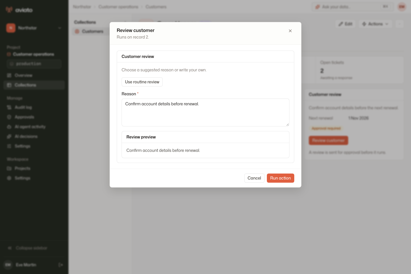
const document = ui.document(ui.node("Stack", {}, [
    ui.node("Text", { value: "Explain why the invoice should be refunded." }),
    ui.node("Field", { field: "reason", label: "Reason", widget: "textarea" }),
    {
        type: "Button",
        props: { label: "Use duplicate-payment reason" },
        onPress: { type: "setValue", field: "reason", value: "Duplicate payment" },
    },
    ui.node("Section", { title: "Review preview" }, [
        ui.node("Text", { value: ui.bind("/form/reason") }),
    ]),
]));

plugin.action({
    collection: "customers",
    name: "Refund last invoice",
    scope: "single",
    form: {
        schema: {
            type: "object",
            properties: { reason: { type: "string", minLength: 3 } },
            required: ["reason"],
            additionalProperties: false,
        },
        uiSchema: ui.form(document),
    },
    execute: async (context) => {
        // Apply your business validation and refund operation here.
        return context.success("Refund requested");
    },
});
In Laravel, pass UI::form($document) as the second argument to
->form($jsonSchema, UI::form($document)). In Go, use
aviato.WithForm(jsonSchema) and aviato.WithFormUI(aviato.UIForm(document))
when registering the action. The data schema stays separate from the UI document.
Field renders the existing schema-driven control, sharing form values, errors,
read-only status and dynamic-form middleware. setValue updates a declared,
writable field through that same middleware. V1 preset values are scalars.
Dot-separated paths such as address.city address nested object properties;
array-item paths and schema-reference traversal are not supported by this control.
For actions using declarative layouts, the entire data schema is validated before submission and again by the agent before approval/execution, including after a before-hook changes values. Hiding a field does not make it optional. Express conditional requirements in JSON Schema or the dynamic form resolver.
Dynamic actions are resolved again at execution under the current caller, so resolvers should compute form metadata without side effects. The server validates submitted values without coercion or silently applying returned defaults. An outdated form may need to be resolved and submitted again.
Invalid UI documents fall back to standard controls while retaining entered values.
The form's JSON Schema also remains available to MCP clients independently of its UI.
Server validation supports synchronous draft-07 schemas, standard formats, and the
existing color and data-url formats. Unknown formats are annotations; unsupported
schema dialects, unresolved references, and asynchronous schemas fail closed.
Component vocabulary
| Type | Props | Children |
|---|---|---|
Stack | gap: small, medium, large | Yes |
Grid | columns: 1–4; gap; variant: default or metrics; ratio: equal or wide-left | Yes |
Section | Optional title | Yes |
Text | value; variant: body, heading, muted | No |
Badge | value; tone: neutral, success, warning, danger | No |
Metric | label, value; optional hint | No |
Property | label, value; variant: text, badge, or code | No |
Field | field; optional label, widget: default, textarea, radio, toggle | No |
Button | label; variant: primary, secondary, or ghost; required node-level onPress | No |
Repeat | items: an array binding | Yes |
Component | Literal name, followed by its declared input props | No |
Grid with variant: "metrics" groups Metric children into a bordered strip.
Use ratio: "wide-left" for a two-column details-and-actions layout; grids stack
on small screens. Property keeps labels and values aligned inside a Section.
Keep the record name in the built-in identity header.
Text, label, title and metric values can be literals or { "$bind": "/record/name" }.
Layout tokens, field paths, component names and event targets are literal.
String values are always plain text. Objects and arrays cannot become HTML or DOM props.
Use computed fields for additional summary data and formatted values, and
ResolveForm for server-dependent form choices, defaults, or layouts.
Reusable components, state and conditions
A document can declare reusable components with typed props:
{
  "version": 1,
  "components": {
    "CustomerName": {
      "props": { "value": "string" },
      "root": {
        "type": "Text",
        "props": { "value": { "$bind": "/props/value" }, "variant": "heading" }
      }
    }
  },
  "root": {
    "type": "Component",
    "props": { "name": "CustomerName", "value": { "$bind": "/record/name" } }
  }
}
Prop types are string, number, boolean, array, object, and any. Every
declared prop must be supplied and extra props are rejected. name is reserved.
Runtime bindings may resolve to missing or null values, including permission-filtered
fields. Components may reference other components, but recursive definitions are rejected.
Binding roots are /record (summary), /form (action values), /state (document-local
state), /props (current component inputs), and /item (current repeated item).
Paths use JSON Pointer escaping (~1 for /, ~0 for ~) and access only own
properties. A binding never fetches data or grants access to additional fields.
Initial state is a map of scalar values, for example "state": { "expanded": false }.
A button may use "onPress": { "type": "setState", "key": "expanded", "value": true }.
Nodes can include a condition:
{
  "type": "Text",
  "props": { "value": "Additional details" },
  "visible": {
    "op": "eq",
    "left": { "$bind": "/state/expanded" },
    "right": true
  }
}
Conditions support eq, ne, present, all, any, and not. Equality uses
strict scalar comparisons. all/any take conditions; not takes condition;
present takes value and checks for neither null nor missing.
State is shared within one document instance, never persisted, and resets when the record, environment, or document changes. Form inputs remain owned by JSON Forms. Summary buttons support local state and action requests. Form buttons support local state and field presets; nested action requests inside forms are disabled.
Test a custom interface
Test the document with both complete and permission-filtered records. Include null and zero values, long strings, and exact identifiers. Verify that conditional content can be opened and closed, and that switching records or environments clears local state.
For forms, test direct typing and presets, required fields, read-only fields, and unsupported layouts. A fallback must retain entered values. Test the action through the agent as well as the browser: an invalid direct request must not execute, and an action requiring approval must wait for that approval.
The SDK wire tests use shared JSON fixtures, the dashboard browser tests exercise native interactions, and the full release journey covers a real agent, form validation, approval, execution, responsive layout, and summary fallback. Repository commands are documented in the docs app README.
Limits and compatibility
UI v1 has a fixed native component catalog and is independently versioned from the plugin RPC protocol. Unknown document versions use the standard summary/form. Agent and dashboard upgrades are required to add new primitive capabilities.
Documents are limited to 32 JSON nesting levels, 8,000 JSON values and 128,000 characters, with individual strings limited to 10,000 characters. Expanded component graphs and rendered trees have a 1,000-node budget. Repetition permits at most 100 items per node. Exceeding a limit rejects the layout instead of rendering a partial form.
A bespoke canvas, map, or editor requires a trusted native primitive added to Aviato. V1 does not accept customer-supplied browser code, arbitrary styling, event expressions, URL navigation, or network requests.